Basic Page Body Blocks
There are different content blocks within the Body section of a basic page, each with unique options and functionality. Read more about each one below!
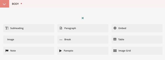
Subheading
The Subheading block provides a way to organize and title subsections within your page, making your content more easily scannable.
Subheadings have their own links
Subheadings are also anchored elements, meaning that you can navigate directly to them using a specific URL. The normal page URL is followed by a forward slash, a hash symbol, then the subheading text (excluding articles/symbols and with words separated by hyphens).
For example, a direct URL to the "Paragraph" section below is https://portal.cca.edu/help/wagtail-documentation/wagtail-guide-portal-basics/page-content/basic-page-body-blocks/#paragraph.
The section-specific URL is automatically generated and will update according to changes to subheading text. If you were to change the "Paragraph" section to "Paragraph Field," the end of the section-specific URL would become /#paragraph-field automatically.
Note: The Subheading block is the only anchored element within the page body in Wagtail. You will not be able to replicate the anchor functionality with any other content block.
Easily copy subheading links:
1) If you hover over an anchored subheading on Portal, you'll see a chainlink icon just to the right of it (in mobile view this icon is visible automatically).
2) Click the chainlink. It should confirm that the section-specific URL has been copied to your clipboard.
3) Paste the copied link into an email, or insert it as a link within a Portal page. Read below for more details.

Using/adding subheading links on your Wagtail page
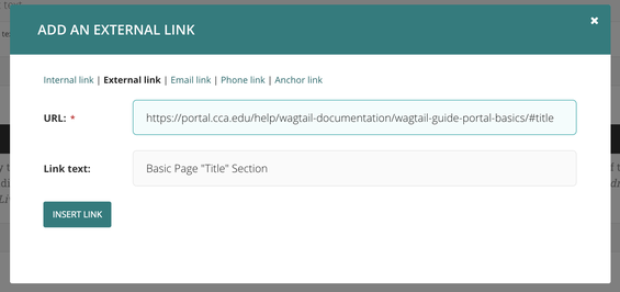
If you wish to link to a specific subheading on your Portal page, you can do so using Wagtail's link functions. Which function you use depends on the
|
Where is the subheading? |
Adding a link to the sidebar? |
Adding a link to the page body? |
|---|---|---|
|
On the page you're editing |
Enter subheading URL as Related Link |
Enter subheading fragment ID as Anchor link |
|
On another Portal page |
Enter subheading URL as Related Link |
Enter subheading URL as External Link |
Paragraph
The Paragraph block is a rich-text element through which you can create the majority of your page's text. The paragraph block defaults to plain text like this, but you can also apply different styles here:
Stylized font
Bold and/or italicize the paragraph text, or use the small subheading (H4) styling to further organize your paragraph into subsections (read more below).
Lists (numbered and bulleted)
Change list tiers by hitting Enter/Return, then Tab to indent a level or Shift + Tab to go up a level.
Line breaks
Use these to better space different chunks of text.
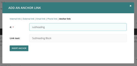
Links (five types):
- Internal link - Browse or search existing Portal pages to link. These links will automatically update if the linked page's URL ever changes, making them less maintenance over time
- External link - Manually enter a URL. This is how you link to any site other than Portal. You can also link to subheadings on other Portal pages or to pre-filtered views of the People Directory or Course Schedule.
- Email link
- Phone link
- Anchor link - Link to a specific subheading on the same page. Unlike for an external link, which requires the full subheading URL, you'll just need to type in the subheading ID.
- The subheading ID is the portion of the subheading URL following the hash mark (#).
- The subheading ID follows a consistent format, if you want to enter it in the Anchor link field manually:
- The subheading text
- Remove capitalization
- Remove special characters ( such as punctuation)
- Replace spaces with hyphens
Please note that the Anchor link will not work if the subheading is on a different page!
Document link
Add a link using Wagtail's documents library, which you can read more about in the Images + Documents page!
Undo/Redo
There are also Undo and Redo buttons, since we all change our minds (and then change them again) from time to time!

Subheadings vs. Small Subheadings vs. Paragraph Text
The images below show the differences between subheadings, small subheadings, and paragraph text (in that order, top to bottom).
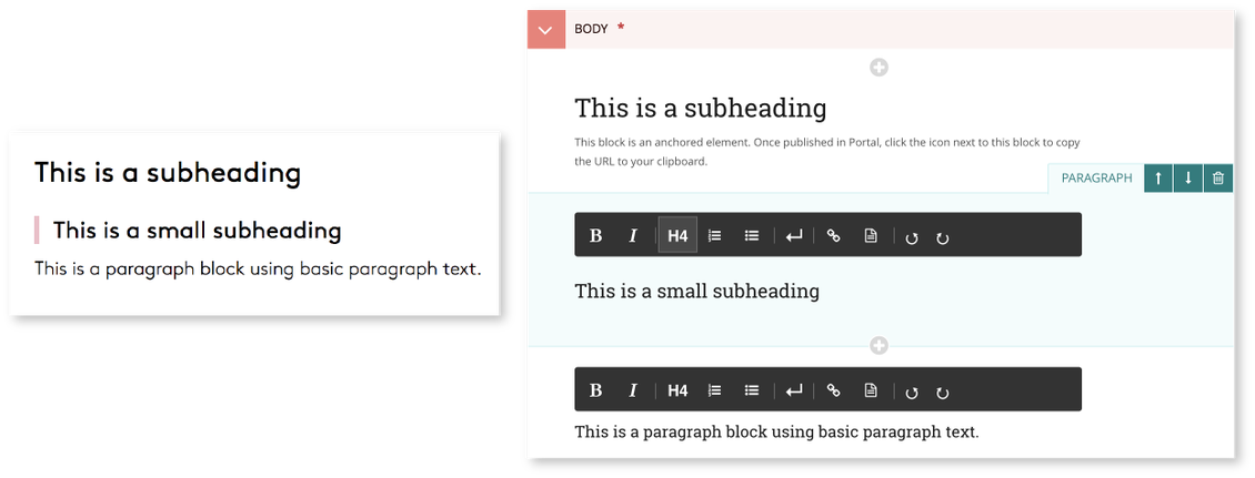
The image on the right depicts the Wagtail view, while the image on the left depicts the Portal view.
How to make small subheadings using the paragraph block:
- Click the H4 button within the paragraph block to enable the small subheading text styling.
- Type in the text for your small subheading.
- You can combine some Paragraph styling within your small subheading, such as inserting links or italicizing words.
- Bolding text within your small subheading will have no effect.
- You can revert to normal paragraph text by hitting the Return/Enter button.
- We recommend that you create separate paragraph blocks for small subheadings and regular text. Though this isn't a requirement, it makes reformatting and editing easier later on!
Image
Insert an Image inline using existing entries in Wagtail's Images library, or upload a new file.
This block has four distinct inputs:
Image alignment (required)
Align images to the left, right or center.
- Left- and right-aligned images will render, at a maximum, at half the width of the content area.
- Center-aligned images will render, at a maximum, at the full width of the content area.
- Wagtail never scales images larger than the original pixel size, so inline images can take up less than the maximum width for the chosen alignment.
Image (required)
Upload your image file or search/browse from existing images in Wagtail's Images library.
URL
Enter a URL in this field to make the image a hyperlink. Links set up here will open in a new browser tab.
Alt text
Fill in a brief description of the image to make it more universally accessible. Text placed here will be read by screen readers, which can provide useful context that may not otherwise be available for users with visual impairments.
For more information on uploading, searching, and editing files on the Wagtail Images library, see the Images + Documents documentation.
Note
The Note block provides you with a means of creating callouts, warnings, and other special notices that need a way of standing out visually from the other text on your page.
In Wagtail, Notes consist of one rich text field (identical to Paragraph except without an H4 option). Notes should be 340 characters maximum.

In Portal, Note text will display within a yellow box:

Break
The Break block adds a horizontal line across the page, which can help you more clearly divide separate blocks of content on a page. Use it to break up distinct subsections of text or align images with text.
Breaks appear between all of the sections on this page!

Table
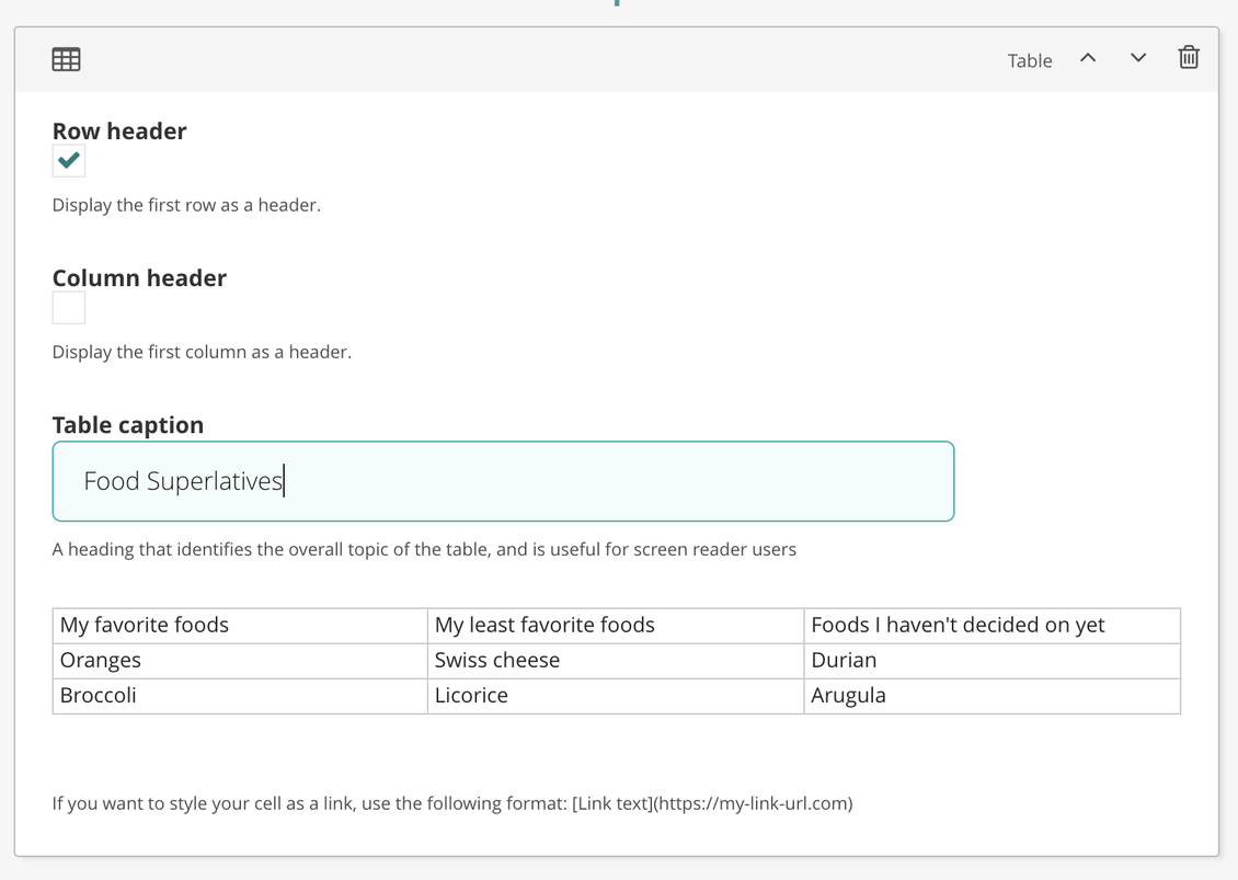
You can also create a table to host content on your page. Enter information in each cell by selecting one of the boxes and typing. Single- or double-click on a cell to enable content entry.
- Make the first table row and/or column a header using the associated check boxes at the top of the block.
- To bring up additional table display options (such as adding or removing rows/columns), right click on the table.
- Finally, the Table block supports hyperlinks. To create a link, it will have to be formatted as follows:
- [Link Text](https://yourlinkhere.com)
- Note the addition of the protocol, “https://”. Depending on how the destination site is set up, you may need to change it to “http://” instead. Either way, this prefix must be present (whether https:// or https://). Otherwise Wagtail will be unable to process the URL when your page is published.
Embed
The Embed block allows Portal editors to display media resources from another website on their pages, such as a YouTube video or a Spotify playlist. The Wagtail block consists of a single text field, where the URL of the content to be hosted should be entered.
Do not use the site’s embed code, as Wagtail will be unable to process the request.
Wagtail supports embedding from these sites:
|
speakerdeck |
dailymotion |
revision3 |
yfrog |
|
app_net |
flikr |
scribd |
clickthrough |
|
youtube |
hulu |
viddler |
kinomap |
|
deviantart |
nfb |
vimeo |
photobucket |
|
blip_tv |
qik |
dotsub |
|
|
facebook_video |
skitch |
ifixit |
five_min |
|
facebook_post |
|
smugmug |
five_hundred_px |
|
slideshare |
soundcloud |
github_gist |
dipdive |
|
major_league_gaming |
collegehumor |
animoto |
yandex |
|
opera |
polleverywhere |
rdio |
mixcloud |
|
kickstarter |
ustream |
chirb |
vzaar |
|
coub |
wordpress |
circuitlab |
minoto |
|
screenr |
polldaddy |
geograph_uk |
videojug |
|
funny_or_die |
bambuser |
hlipp |
sapo |
|
wistia |
ted |
geograph_gg |
vhx_tv |
|
justin_tv |
mobypicture |
dailymile |
crowd_ranking |
|
official_fm |
twenty_three_hq |
dipity |
etsy |
|
spotify |
urtak |
meetup |
clikthrough |
|
shoudio |
cacoo |
roomshare |
ifttt |
|
issuu |
tumblr |
Panopto
The Panopto block is a special kind of embed, made specifically for embedding videos hosted on Panopto.
Aspect Ratio
The Panopto block requires you to select the Aspect ratio (either 16:9 or 4:3) you would like the embedded video to display as.
Delivery ID
You must also enter the video's Delivery ID. You can find this by within a video's Settings in Panopto.

Within the Settings menu, click the Manage tab. Copy the listed Delivery ID, and paste it into the corresponding field in the Panopto Wagtail block.

Set video to "Public"
In order for your Panopto embed to function properly, you'll need to lift any share restrictions on your video in Panopto.
Access the video Share settings in Panopto. Under Who can access this video, check to make sure that "Anyone who has the link" displays. If not, click Change, then select Public (unlisted) from the selection list.
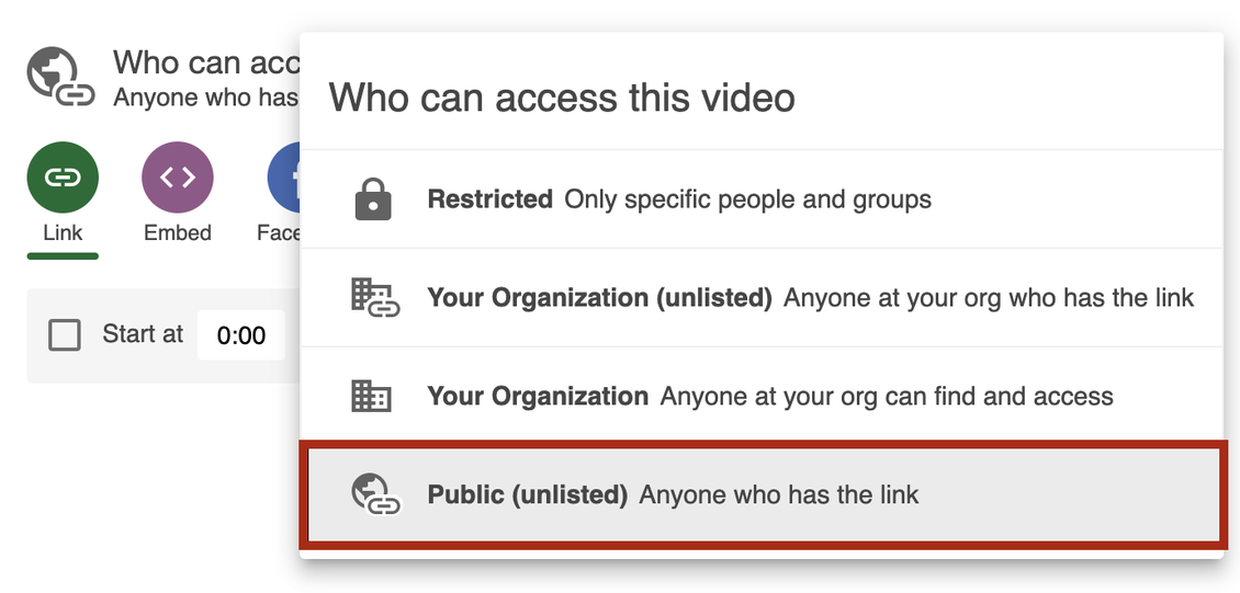
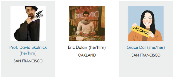
Image Grid
Image Grid blocks display images in a page card-like format. On a live Portal page, the image grid appears as an arrangement of in-line cards, which can be used to identify departments or people, or to navigate to subpages. The fixed size of a Grid block is 230 by 325 pixels.
There are four available inputs in the Image Grid block:
Image (required)
Images are centered in the upper part of the blocks and constrained to 150 by 150 pixels.
URL
Enter a URL to make a grid item (image, title, caption) a clickable hyperlink.
- By default, the Image Grid box is white, but when a URL is entered it becomes gray.
- Links to other Portal pages will open in the same tab when clicked, whereas external URLs will open in a new tab.
Title
The maximum allowed text input, for Title and Caption, is 100 characters. 30 characters (max) are dedicated to the Title field. Only single lines of text are supported, so breaks or text indentations are not possible.
Caption (required)
The Caption is often used as a description of the image or the URL destination. Unlike Title, Caption has no character input limit, but text will truncate after 100 characters (between both Title and Caption).
Related Pages
- Wagtail Guide: Portal Basics
- Portal Page Architecture
- Accessing Wagtail
- Navigating Wagtail
- Page Types (Templates)
- Creating, Saving, + Publishing Pages
- Page Privacy, Unpublishing, + Deleting Pages
- Moving Pages and Reordering Content
- Page and Site History (Formerly Page Revisions)
- Page URLs
- Basic Page Content
- Basic Page Body Blocks
- FAQ Page Content
- Images + Documents

